


You think the official BLS NFP series is worrying, consider the alternatives:
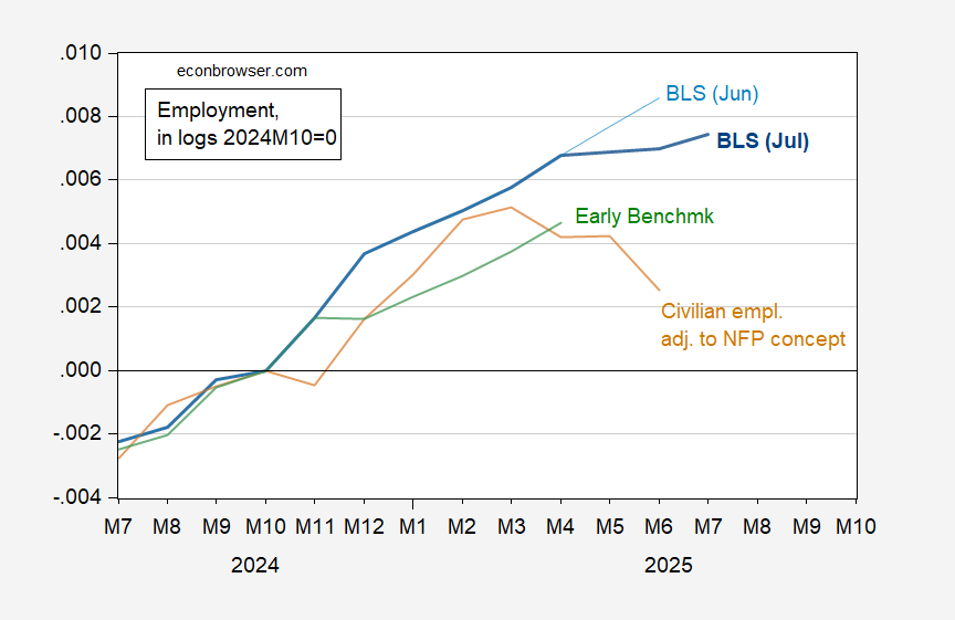
Figure 1: BLS establishment nonfarm payroll (NFP) July series (bold blue), Jun series (light blue), Philadelphia Fed early benchmark (green), and experimental BLS household series adjusted to NFP concept, with smoothed population controls, centered 3 month moving average (tan), all in logs 2024M10=0. Source: BLS via FRED, BLS, Philadelphia Fed, and author’s calculations.
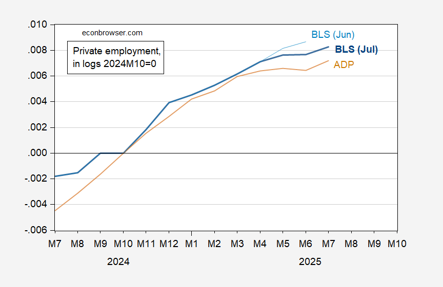
Figure 2: BLS establishment private nonfarm payroll (NFP) July series (bold blue), June series (light blue), and ADP series (tan), all in logs 2024M10=0. Source: BLS, ADP via FRED, and author’s calculations.
Finally, the household series:
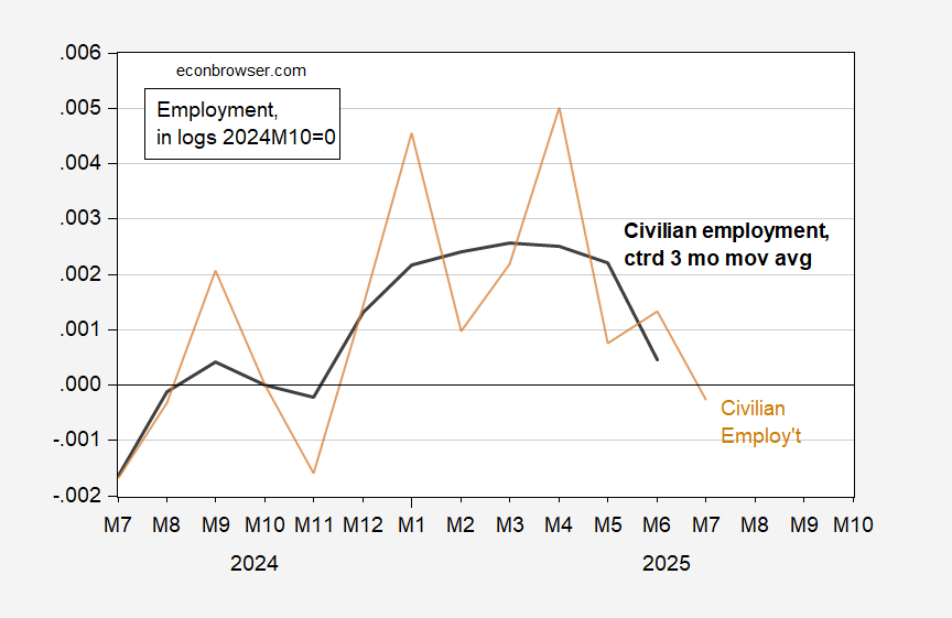
Figure 3: Experimental BLS household series, with smoothed population controls, (bold black), and centered 3 month moving average (tan), all in logs 2024M10=0. Source: BLS via FRED, and author’s calculations.