


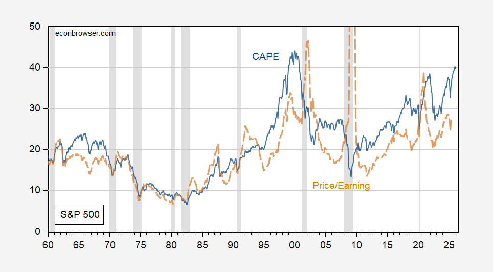
September P/E ratio at 28.

Figure 1: CAPE (blue), P/E ratio (light brown). NBER defined peak-to-trough recession dates shaded gray. Source: Shiller, NBER.
SP500 price/forward earnings is 22 in January (according to Yardeni), just below the pre-2000 peak at 24.
That being said, the real 10 year yield is about 1.8 ppts below the rate just before 2000.
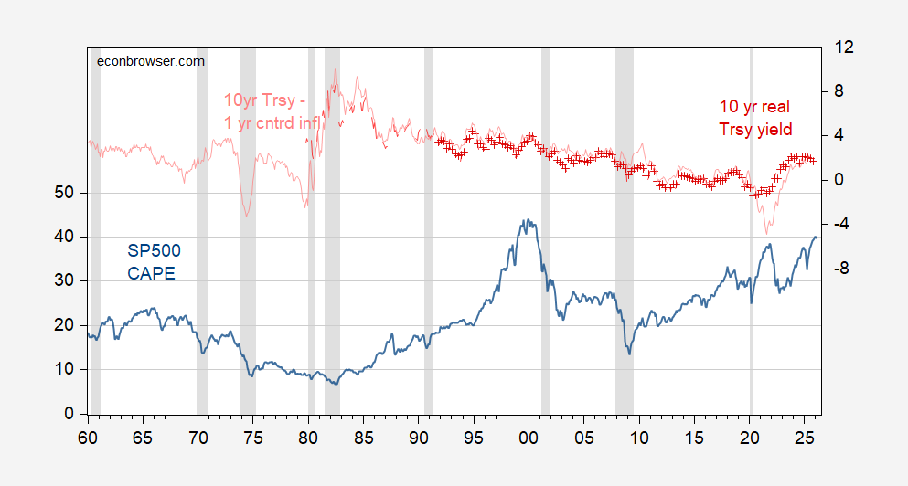
Figure 2: CAPE (blue, left scale), real 10 year Treasury yield, in % (red). Real rate calculated using SPF 10 year median (dark red +), Blue Chip and Livingston 10 year (red), and centered one year core inflation (light red). NBER defined peak-to-trough recession dates shaded gray. Source: Shiller, Philadelphia Fed, BLS, NBER and author’s calculations.
That being said, the average SP500 CAPE doesn’t convey the extreme represented by the Magnificent 7. It’d be interesting to see if a similar concentration existed in the late 1990’s boom.